Why co-design is key to creating patient information
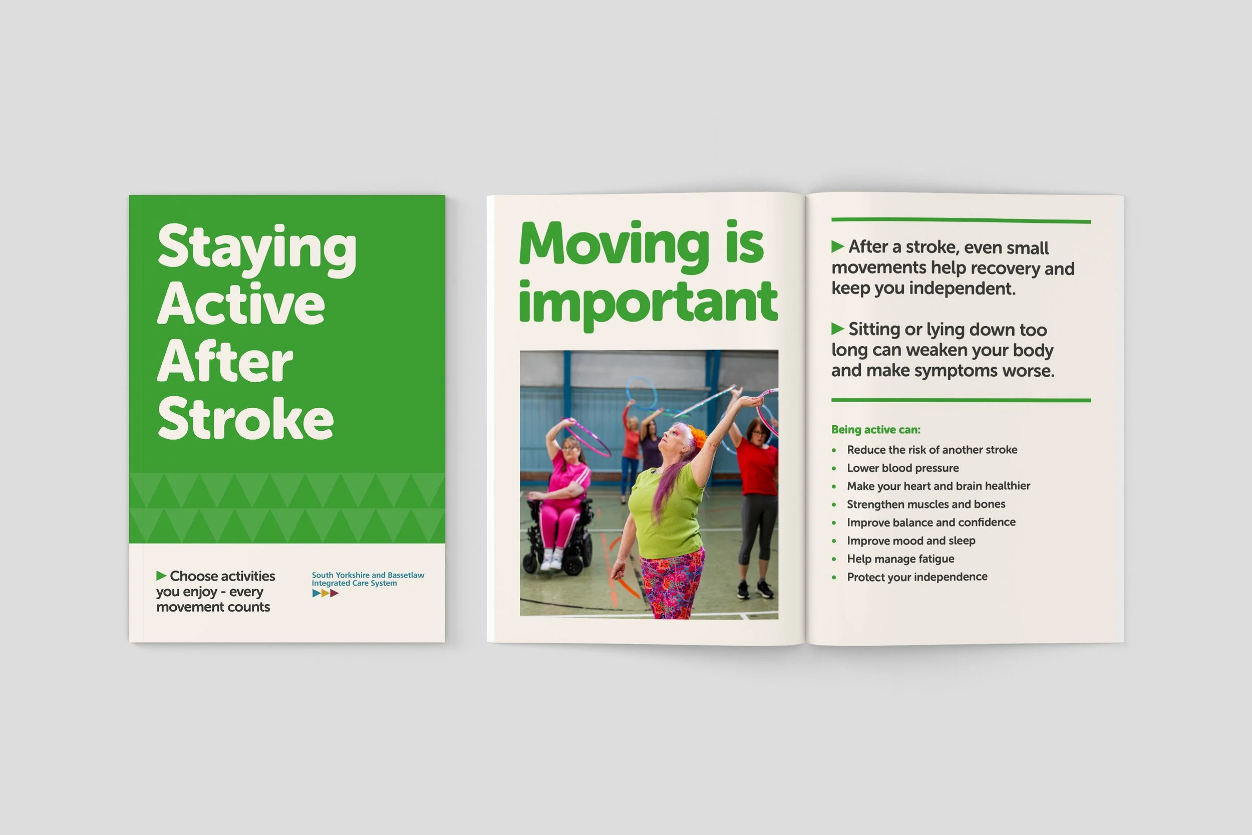
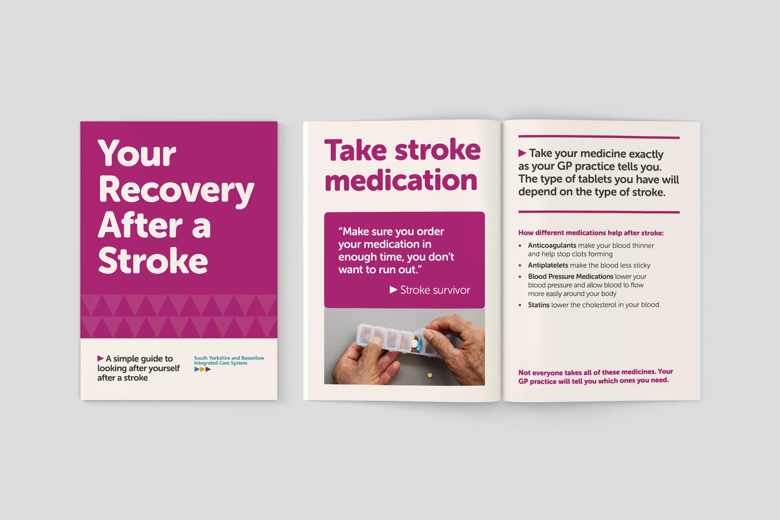
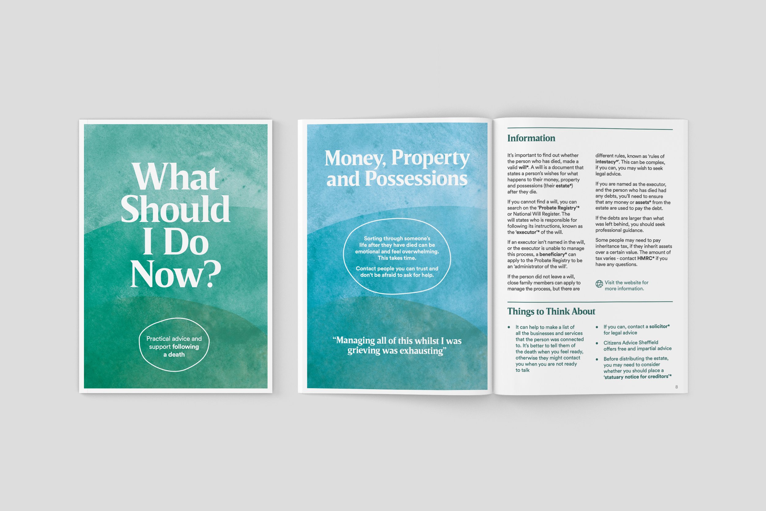
Final patient information leaflet for South Yorkshire Integrated Stroke Delivery Network
Over the last few years, I’ve worked on various patient information leaflets around brain health, stroke and TIA awareness, dementia and bereavement. Whereas many patient information leaflets follow a text-heavy format, often written primarily by clinicians, I’ve had the opportunity to co-design the content, structure and visual design of new materials alongside people with lived experience.
Across all of these projects, one thing has become increasingly clear to me: thoughtfully co-designed information matters most when people are overwhelmed, anxious, unwell or trying to process difficult information quickly.
What’s also become clear is that co-design within graphic and information design still feels relatively uncommon. Designers are often brought in at the end of a project to lay out pre-written content, rather than being involved in shaping the information itself.
But in patient information, content, co-design and graphic design can’t really be separated.
As a design researcher, co-design allows me to work not just on how information looks, but on what information is needed, how it should be structured, what language feels accessible, and how people are most likely to engage with it. In an ideal world, a content designer and specialist graphic designer would be involved throughout the process too, but often these roles overlap.
This becomes especially important when designing for people who may be:
distressed or overwhelmed
experiencing mild cognitive impairment
living with memory or concentration difficulties
unfamiliar with medical language
reading in a second language
navigating lower literacy levels
Across workshops, people responded to draft materials in simple but incredibly useful ways. They highlighted unfamiliar words, matched imagery to themes, suggested symbols that could support understanding, and reviewed one spread at a time to discuss what felt clear, confusing or overwhelming.
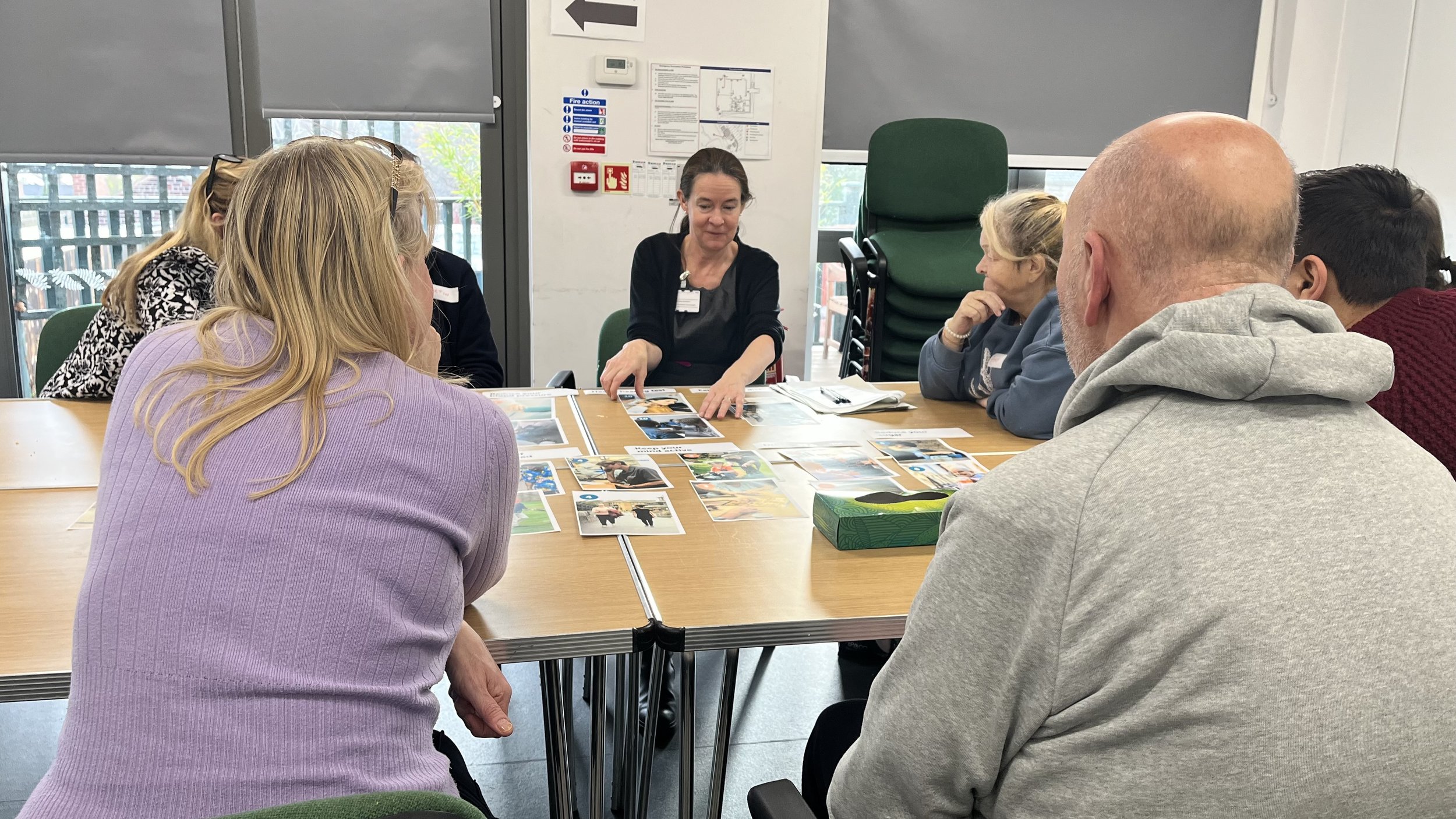
Dr Kirsty Harkness - Consultant Neurologist STH exploring imagery with AgeUK group
These workshops were made possible through partnerships with trusted community organisations, facilitators, translators and support workers who already had relationships with participants. Their involvement was often essential in helping people feel comfortable sharing their experiences and perspectives. We also made sure participants were reimbursed for their time, recognising the expertise they were bringing through lived experience.
A lightbulb moment that sticks in my mind was watching someone use a translation app on a leaflet that referred to "blood vessels". They were struggling to understand the content and explained through an interpreter that "vessel" was translating directly to "ship" or "boat". A term that felt straightforward to the project team suddenly became a barrier to understanding. We changed the language to "veins and arteries" where appropriate.
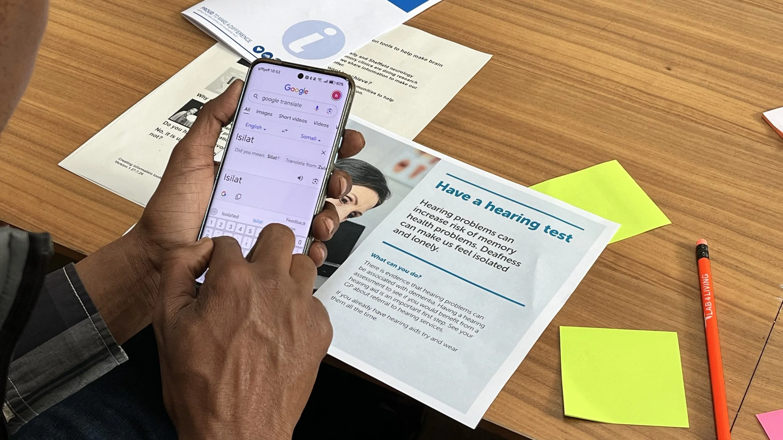
Person with lived experience using google translate
In another workshop, I noticed people consistently connecting more strongly with imagery showing real people carrying out actions than with objects or icons alone. A photograph of someone drinking water, for example, generated a much stronger response than a photograph of a glass of water or a symbol intended to represent hydration.
Working with people with lived experience, including people at risk of dementia, people who had experienced stroke or TIA, and people whose first language was not English, continually challenged assumptions about what makes information accessible.
The process repeatedly highlighted the importance of:
clear and explicit imagery
diverse representation
symbols and icons that support understanding
simple language
strong hierarchy and structure
reducing the amount of information on each page
Final patient information leaflet for South Yorkshire Integrated Stroke Delivery Network
These are relatively simple design decisions, but they can make a significant difference to whether people are able to understand and act on information when they need it most. Throughout each project, the co-design process helped shape a bespoke accessibility checklist, combining established good practice with insights gathered directly from participants.
The workshops were strongest when clinicians were involved alongside participants and the design team. Having clinical expertise in the room meant content could be refined while discussions were happening, maintaining clinical accuracy while listening carefully to how information was actually being interpreted. Some of the most useful conversations happened when clinical intent and user understanding didn't quite align.
In healthcare and public services, thoughtful design is not just about aesthetics. It's part of care.
Final information leaflet for Compassionate Sheffield